Cyclists don’t tend to talk about tyres. When you buy a new road bike and breathlessly give the rundown to your friends, you first mention the maker, then the material, the groupset, the wheels and the appearance. Even the saddle or handlebars will get a name check before the rubber.
Nobody falls out fiercely debating the worth of one tyre brand over another. Two things matter most: do they puncture with undue regularity? Do they slip in the wet? If the answer to both is no, then good: on yer bike.
So, it can be easy to ignore the importance of tyres: the best are the ones we forget about because it’s been so long since we had a problem. But advertisements about them? That’s a different story.
For over a hundred years, Pirelli has taken risks and pushed the limits with its publicity campaigns, usually while promoting products which are, ironically, all about reliability and adhesion.
Custom paint (part III): frames inspired by cars and motorcycling
Their innovative designs take the beholder into a whole different universe of bright colours, comic characters and creative design that still conjures up advantageous qualities of their products. Even their distinctive, long-standing logotype, the elongated P, catches the eye, while also hinting at the elastic properties of rubber.
“We have always tried to speak of Pirelli and our tyres in an unconventional way,” Antonio Calabrò, director of the Fondazione Pirelli, says.
“From the kid who races on his bike defying the wind and feeling free, to the humerous figures of Riccardo Manzi, to Olympic champion Carl Lewis, wearing red high heels alongside the claim ‘Power is nothing without control,’” he says, referring to the famous 1994 campaign shot by Annie Leibovitz.

“Then, those adverts for high-performance snow tyres or car and motorbike ones. An advert that captures the imagination, gives a sense of movement and makes you smile, naturally stays in your mind.”
Alongside the likes of fellow household Italian brands like FIAT and Campari, Pirelli were at the forefront of Italian poster design. Channelling everything from art nouveau to Futurism, they hired legendary poster artists and designers like Leonetto Cappiello, Marcello Dudovich, Alan Fletcher, Massimo Vignelli and Bob Noorda.
“Ours is a culture of images which entrusts itself to suggestions of art, to the perfection of design, to the strength of beauty,” Calabrò says.
Their focus on aesthetics – posters as poetry – was a risk, flying in the face of the developing transatlantic style of repetitive slogans and obvious maketing messages. “We say that business is culture, that doing good business is making good culture, and vice versa,” Calabrò says.
Desire: Legor Porecca Road – Italian style from Barcelona
In the period between the end of World War Two and the late ‘60s, Pirelli enjoyed its zenith in advertising communications, its distinctive, in-house style making it a leader in graphic design.
At the same time, cycling and the Coppi-Bartali dualism gripped the Italian public, who now had the spending power to afford bikes, cars, Vespas and various other consumer products amid an economic boom.
Pirelli have long been associated with cycle racing. The company supplied the lion’s share of tyres in the inaugural Giro of 1909, and Italian greats like Binda, Girardengo, Coppi and Bartali used their products.
One of the company’s leading directors, Giuseppe Vigorelli, was behind the eponymous Milanese velodrome that has become a sporting shrine.
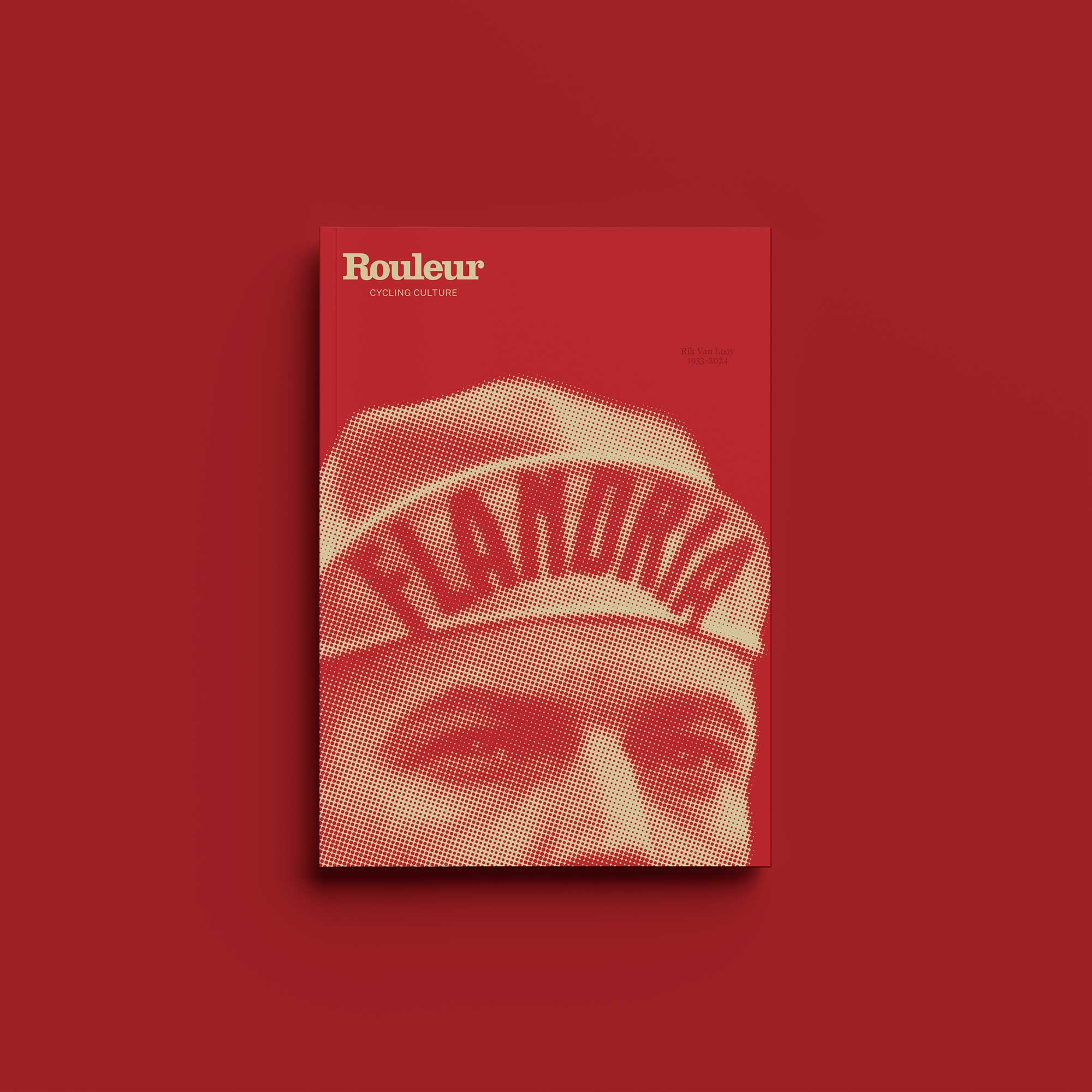
Then there was the Gran Premio Pirelli, a one-day race for the country’s best young talent in the late ‘40s and ‘50s which served as a springboard to success for the likes of future Monument winners Nino Defilippis and Diego Ronchini. Out of the cycling tyre market since 1995,Pirelli is back with a new range, the P Zero Velo.

The worlds of cycle sport and advertising may have transformed since the poster’s heyday – up against the internet and a demand for greater immediacy – but for Pirelli, thoughtful, good-looking design still matters.
“In the communication and construction of its brand, Pirelli has always insisted on beauty,” Calabrò says. “Beauty as a value, be it aesthetic or ethical. Beauty as regards the qualities of people and the power of places.
“The beauty of the female protagonists in the advertisements, the Pirelli films, of its fashion choices and naturally of the Pirelli Calendar: an authentic and profound beauty, considered with great respect. But also the beauty of products, with a design that values technique and functionality … all in all, beauty as the quality of life and work.”
Feast your eyes on the following selection from the Fondazione Pirelli’s vast archive and it’s hard to dispute that yes, even tyres can be beautiful.
All images courtesy of Pirelli. These items are part of Pirelli’s historic heritage, now preserved in the Historical Archive of the Pirelli Foundation. fondazionepirelli.org

The post Slick advertising: Pirelli’s vintage posters appeared first on The world's finest cycling magazine.